
Charts
!!!VERY IMPORTANT!!! Charts are currently going a serious upgrade, with a range of new charts being added to the system. Right now you will not see the graphs appear as you use their code: you will see the plaque promising that the graphs will be ready soon.
Please, mark the questions with the graph code with the tag CHARTS so we could find these questions and recheck with the produced graphs matched nicely with the code
Charts that Are Ready
These charts are already done and you can use them for your questions. The graphs are successfully integrated and will appear as you set them.
| Name |
View |
Specs Explained |
Code Example |
|
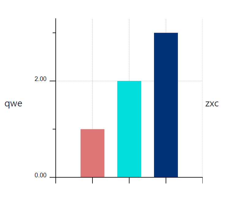
Vertical Bar Chart
chart.vbar is a simple chart with several vertical bars |
|
axis y legend ###chart.vbar(bar lengths 1 in order, bar length 2 in order, bar length 3 in order){label A, label B, label c}### axis x legend |
|
|
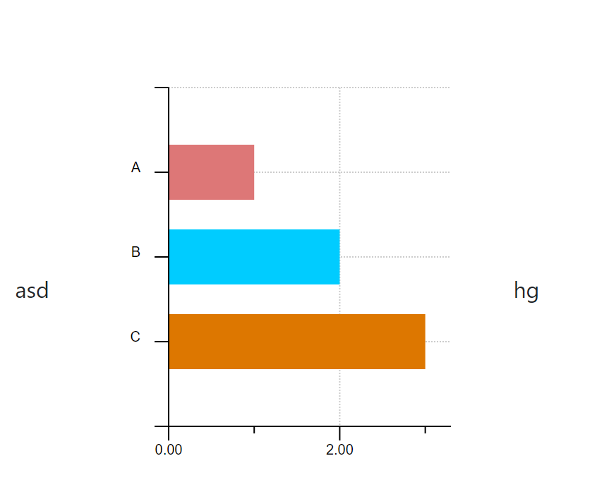
Horizontal Bar Chart
chart.hbar is a simple chart with several horizontal bars |
|
axis y legend ###chart.hbar(bar lengths 1 in order, bar length 2 in order, bar length 3 in order){label A, label B, label c}### axis x legend |
asd ###chart.hbar(1,2,3){A, B, C}### hg |
|
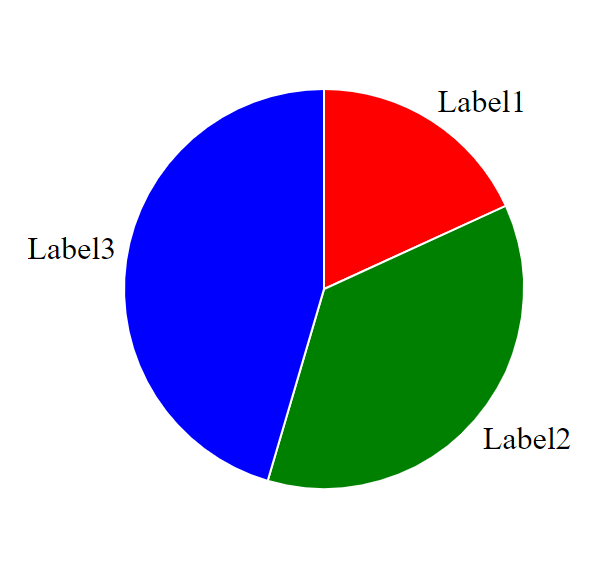
Pie Chart
chart.pie is a round charts with sectors representing data |
|
###chart.pie(pie sector 1 in order, pie sector 2 in order, pie sector 3 in order){label A, label B, label C}[Colour 1, Colour 2, Colour 3]### *please note whatever value you take for pie sectors, the system will consider the sum of sectors' values to be 100% of the pie chart and will calculate accordingly |
###chart.pie(10,20,25){Label1,Label2,Label3}[red,green,blue]### |
Charts That Will Soon Be (But You Still Can Use Them)
If your question requires so, soon you will be able to construct the following types charts in the system, using the corresponding functions. The graphs are not ready yet, but the code for them is. You can use the code in your questions and the graphs will be added to it later.
Please pay attention that
- the View column is a visual corresponding the graph and the example code except for the cases when it is stated otherwise in the table
- Spec Explained is a column with full code & functionality of a graph explained
- Code Example is a usage sample that relatively corresponds with the pictures in the View column.
Also note that you may use randomized variables (a,b,c) in bar lengths brackets and randomized words in graph titles &title=namegirl1.
| Name |
View |
Specs Explained |
Code Example |
|
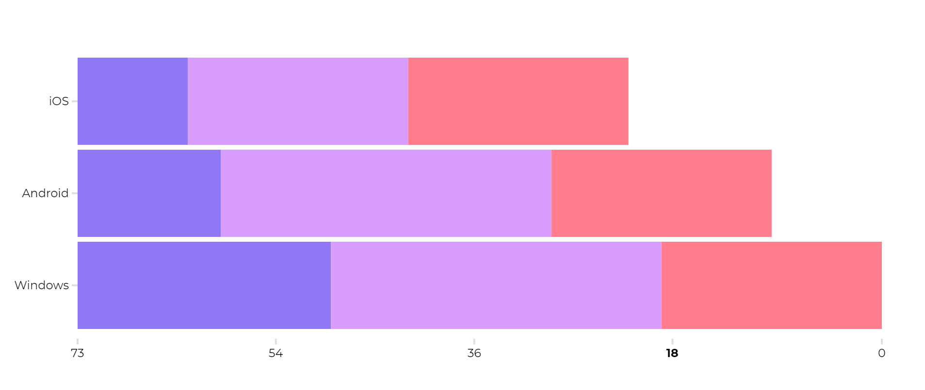
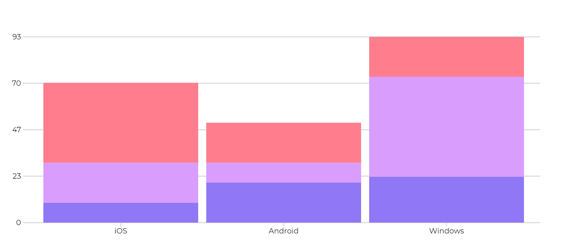
Horizontal Stacked Bar Chart
chart.hbarstack is stacked horizontal bar chart where the horizontal bars are divided into data sectors. |
|
###chart.hbarstack((bar1 lengths in order),(bar2 legths in |
###chart.hbarstack((a,b,c),(d,e,f),(g,h,i)){iOS,Android,Windows}[(blue, A),(purple, B),(pink, C)]&title="Multiple words title"### |
|
Vertical Stacked Bar Chart
chart.vbarstack is stacked vertical bar chart where the vertical bars are divided into data sectors. |
|
###chart.vbarstack((bar1 lengths in order),(bar2 legths in |
###chart.vbarstack((a,b,c),(d,e,f),(g,h,i)){iOS,Android,Windows}[(blue, A),(purple, B),(pink, C)]### |
|
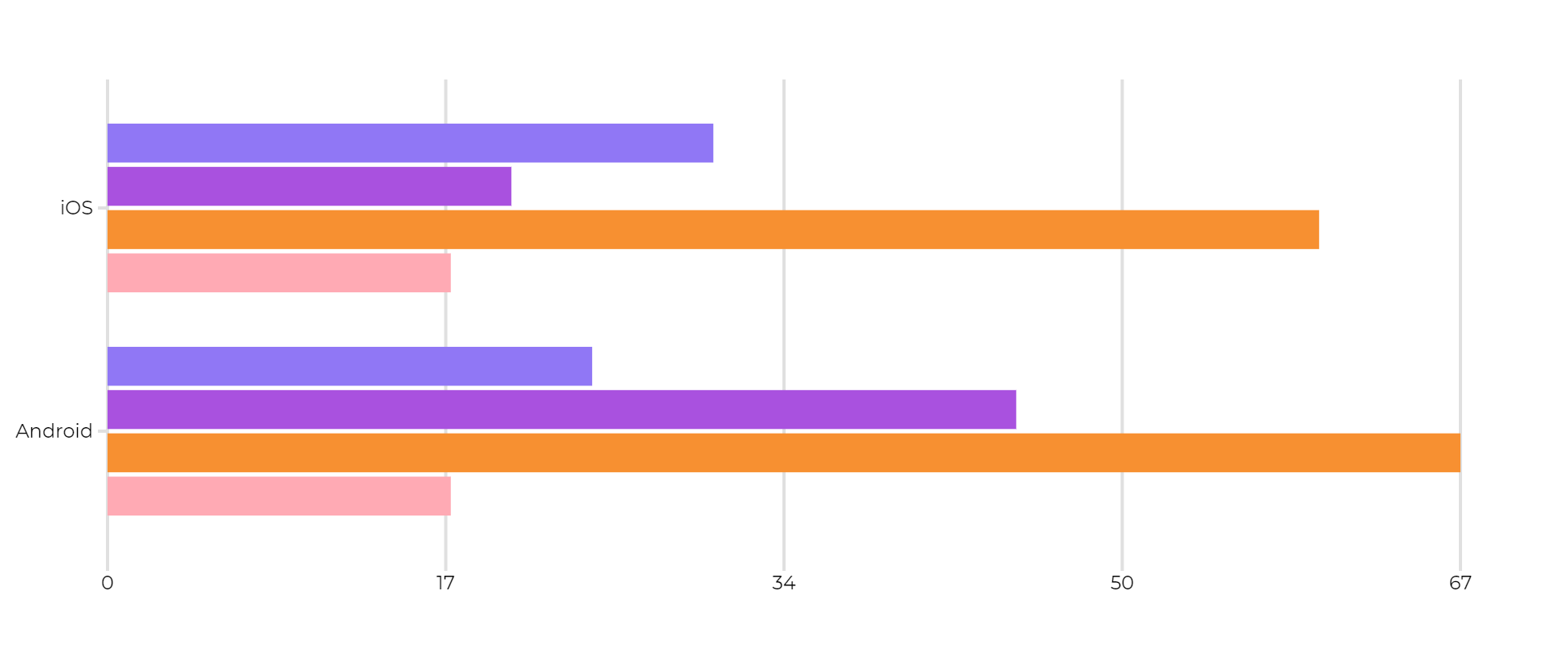
Horizontal Clustered Bar Chart
chart.hbarcluster is a clustered horizontal bar charts where the bars are put in groups of "data-clusters". |
|
###chart.hbarcluster((cluster1 lengths in order),(cluster2 |
###chart.hbarcluster((a,b,c,d),(e,f,g,h)){iOS,Android}[(blue, A),(purple, B),(orange, C),(pink,D)]### |
|
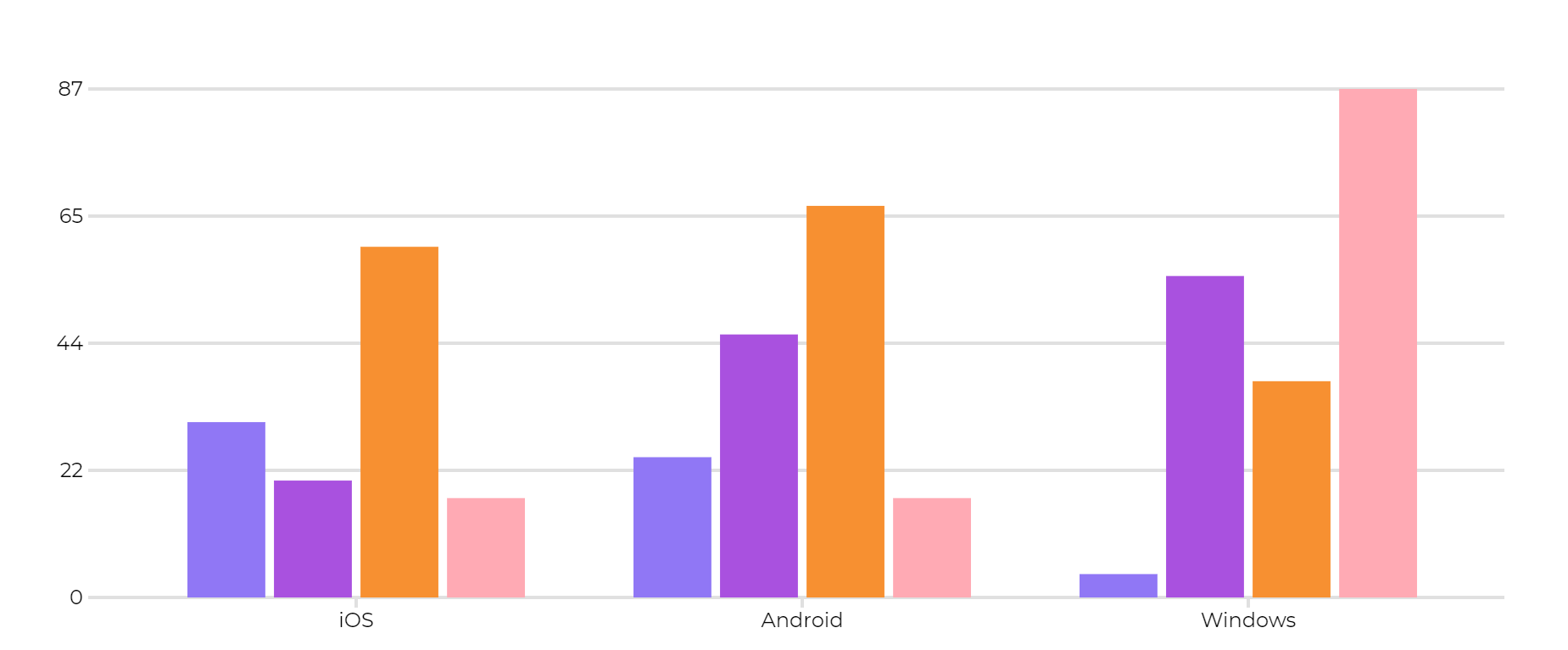
Vertical Clustered Bar Chart
chart.vbarcluster is a clustered vertical bar charts where the bars are put in groups of "data-clusters". |
|
###chart.vbarcluster((cluster1 lengths in order),(cluster2 |
###chart.vbarcluster((a,b,c),(d,e,f),(g,h,i),(j,k,l)){iOS,Android,Windows}[(blue, A),(purple, B),(orange, C),(pink, D)]### |
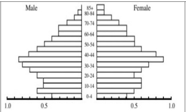
| Pyramid Chart |
picture does not match the code example
|
###chart.pyramid(bar lengths in order, from bottom top, in |
###chart.pyramid((a,2),(4,5)){iOS,Android}[LFT,RT]&title=namegirl1### |
|
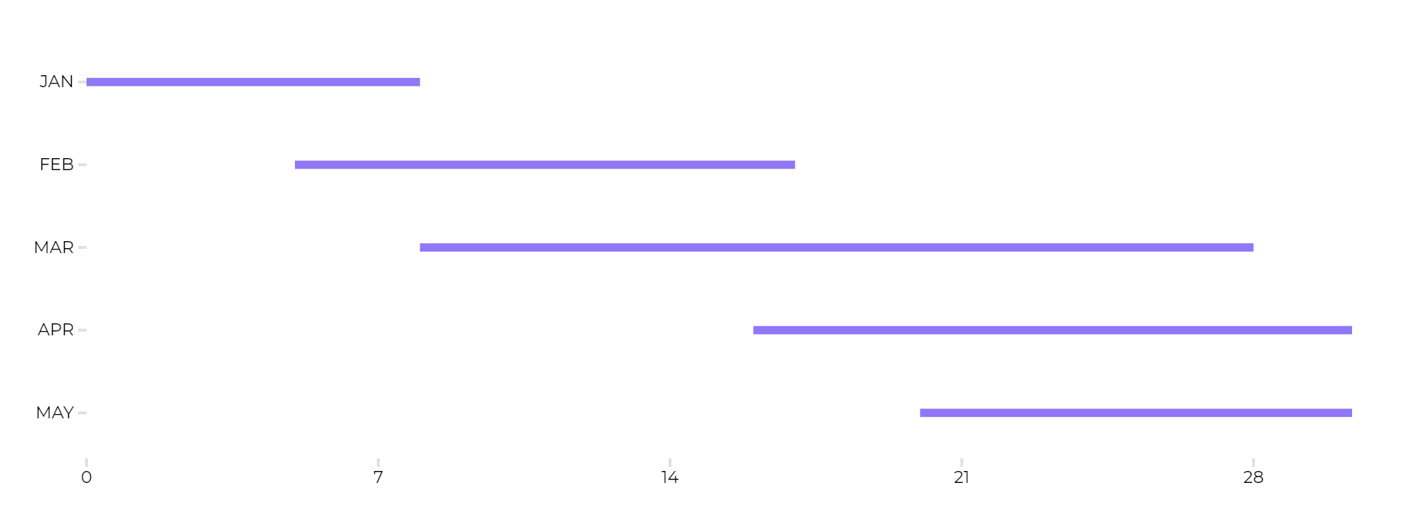
Gantt Chart
chart.gantt is one regular Gantt chart with all the characteristic of an average Gantt chart. |
|
###chart.gantt((start1, finish1),(start2, finish2),…){bar |
###chart.gantt((a,b),(c,d),(e,f),(g,h),(i,j)){JAN,FEB,MAR,APR,MAY !!}&title="test title"### |
|
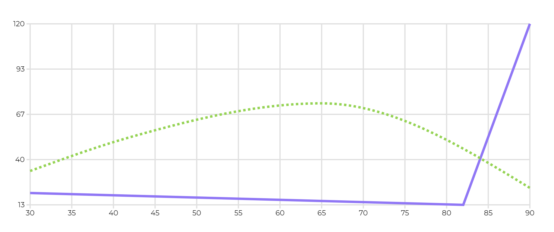
One Line Chart
chart.conpoint is a line chart of a kind that typically shows the progress of some data of phenomenon, as it escalates and goes down. |
picture does not match the code example
|
###chart.conpoint((x1,y1)s(x2,y2)c[somex,somey](x3,y3)){line-withpoints}&title=”title”;&xaxis=”something”;&xaxisstyle=arrow;
here s means STRAIGHT connection |
###chart.conpoint((a,2)s(4,5)s(1,10)c[2,20](5,20))&title=a### |
|
Multiple Line Chart
chart.mconpoint is a line chart of the same type as chart,conpoint but it allows you to display two lines simultaneously |
picture does not match the code example
|
same logic as chart.conpoint, but two lines are set instead of one |
###chart.mconpoint[((a,b)s(c,d)s(e,f)c[g,h](i,j)){Label1, stroke, red},((k,l)s(m,n)s(o,p)c[q,r](s,t))]&title=a### |
No Comments